Studio Conover: Color and Communications Design for Materials
Images courtesy Studio Conover
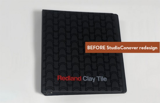
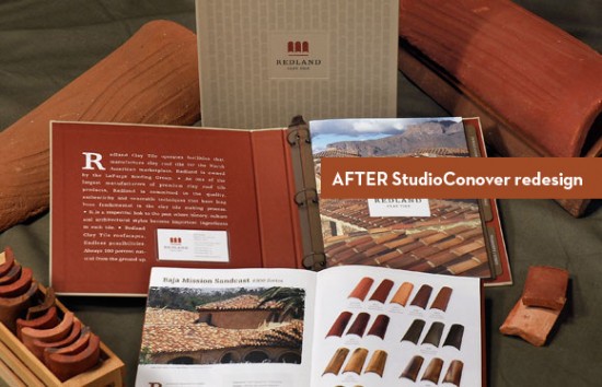
You’ll be happy to know that in San Diego, California, a ray of hope shines like a beacon up from the inky dark hole of architectural product literature. Said ray of hope is Studio Conover, “a cross-disciplinary company focusing on architectural consultation, materials specification and product design for the built environment. [They] specialize in exterior colorways and materials specification consultation with architects, builders and developers,” according to David Conover, the eponymous owner of the studio. Really, they’ve got a great idea. Information about a product that is organized, accurate, and communicated in a clear and aesthetically pleasing manner attracts architects like honey attracts bears, which makes it more likely that they will specify a certain product or material (the architects, not the bears).
The studio also happens to put out a fantabulous blog called Contexture that is full of useful information (some of which I am currently reviewing as I try to fix all the Internet Explorer CSS bugs I’ve managed to incorporate into this website in the past few days). The name for the blog is a mashup of the words Conover and Texture, which is an appropriate connotation, given that:
“Much of our process involves working texture within and throughout the context of the particular job at hand. Whether we’re selecting a specific brick shape, color and installation pattern for a residential community, referencing an archaic woodtype letterform or contemplating the coarseness of cement or paper, texture remains a predominant underlying component simply because it is so representative of the products and projects we work on.”
Hopefully, people who make the stuff we use to construct buildings will use the people who design the stuff that explains what people make to help the people who design the buildings, and everyone will be better off!
*I’ve been meaning to write a post about plastic grass for ages, but since lawns in general are a hot button issue for me, I’m afraid it’s just going to be a massive rant. I guess this post started out as a rant too – sorry.


[…] Studio Conover: Color аחԁ Communications Design fοr Materials … […]
Every designers’ dirty little secret is that they copy other designers’ work. They see work they like, and they imitate it. Rather cheekily, they call this inspiration.
R.Kyle
Product Design Company
Leave a Wordpress Comment:
Ads
Watch ARCHITERIALS Videos on vimeo
Like on Facebook
Twitter
Flickr
Hit Counter
Ads
Blogs
Green
Journals/Publications
Materials
Network/News
Offices/People
Resources
Science
Pages
Archive
RSS and Email Subscriptions
Tag Cloud
3D 3D printer AB FAB academic acid acrylic actuated matter adaptive adhesive adsorption aerogel air air conditioning alloy aluminum amnh antibacterial antifungal ants april fool's architecture architecture robot artificial skin autonomous aviation awesome bacteria bamboo bananas beer bench bend bending biennale biocomputing biodegradable biodegradeable biomaterials biomimetics biomimicry biominerals biopolymer birds blast blast-resistant block blocks blogs Bloom Box brazil brick bubbles bucky bulk metallic glass butterfly calera canvas carbon carbon fiber carbon nanotubes carpet cars ceiling cellulose cement ceramic chain link chair charcoal charlie sheen chemicals chiller clay cloth cloud cmu coils color color-changing communication compound computer concrete condensation conducting conductive context cool coral cracks crystal cyborg demakersvan design digifab dirt disaster dna dror drywall dutch dynamic EAP earth ecocradle ecolect e coli ecology ecoresin ecovative elastic electric electricity electrochromic electroluminescent electronic energy energy recovery environment evaporative cooling experiment fabric fabrication facade fiber fiberglass fiber optic fiber optics fibers film FIRE flexible flickr fly ash foam fungus furniture garbage gel geodesic dome geometry gfrp gilgamesh glass glass fiber glow glue gold graphene green greensulate gsapp gypsum hard heat heavy heidi klum helix hemp hexagon hidden high performance hive honeybee humidity ice India ink insulation interference Internet inventables invisible invisible ink jello jellyfish just add water kevlar kinetic korea lace lamboo laser lattice leaves LED leed LEGO light light emitting light transmitting liquid lo mein london Loop.pH machines magic magnetic marine material materials meatball melting memory metabolic engineering METAL metal panel metamaterial micro microsensor microtools military milk MIT moisture multi-layer mushrooms mycelium nano nanogel nanotech nanotubes NASA new noise non-metallic oil OLED OMA ostrich oysters packaging paint panel panels paper paperfoam paraffin wax particles particulates petroleum phase change phosphorescent pink PLA plastic platinum pm-10 poetry pollution polymer polymers porcelain power precast printed printing protein public quadror radiant rain rammed earth reclaimed recycled reflective refracting Rem Koolhaas resin robot robotics roof rubber rugged sand sealant sealer search segmented self-healing sensor shape memory silica silicon silk skin skittles slats smog soft solar solar cell solar cells solar paint solid solid state lighting sound spider spider glue spray stabilized sand stone stretch stretchable strong structural structure studio dror sun sunglasses super supercritical sustainable switzerland tags tape technology TED tensile TEXAS textile textiles texture thermal thermochromatic thin thin film thread tiger stone tile tiles timber tio2 tires toaster tokujin yoshioka touch touch-sensitive toxic transparent t shirts tulip ultra-thin university of akron university of connecticut upcycling virus voc wall wallpaper WATER web wet whale wires WOOD woodwool wool workshop
WP Cumulus Flash tag cloud by Roy Tanck and Luke Morton requires Flash Player 9 or better.
Recent Comments
Ads